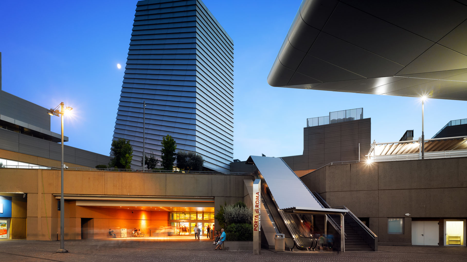
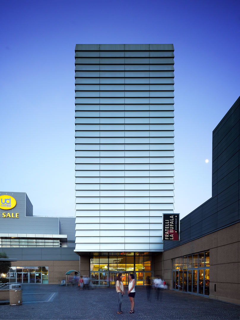
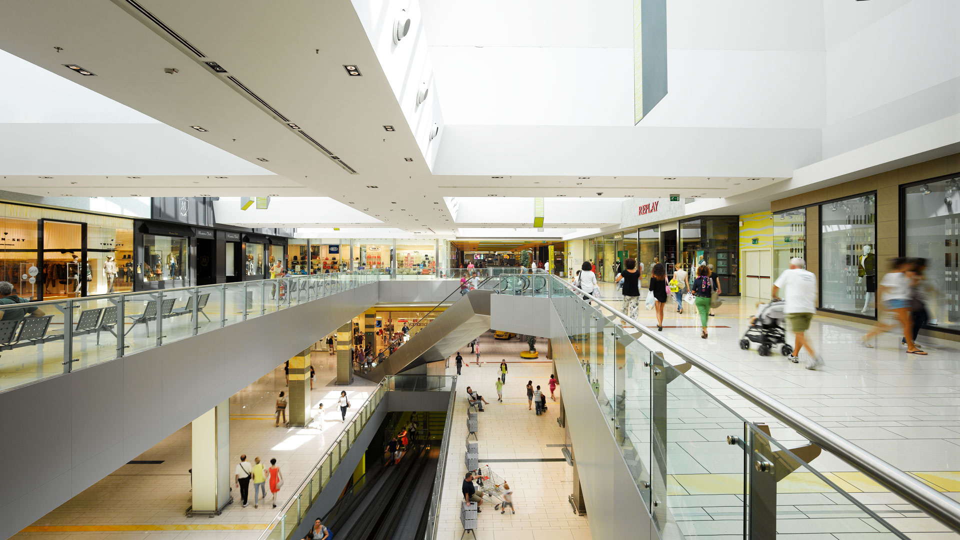
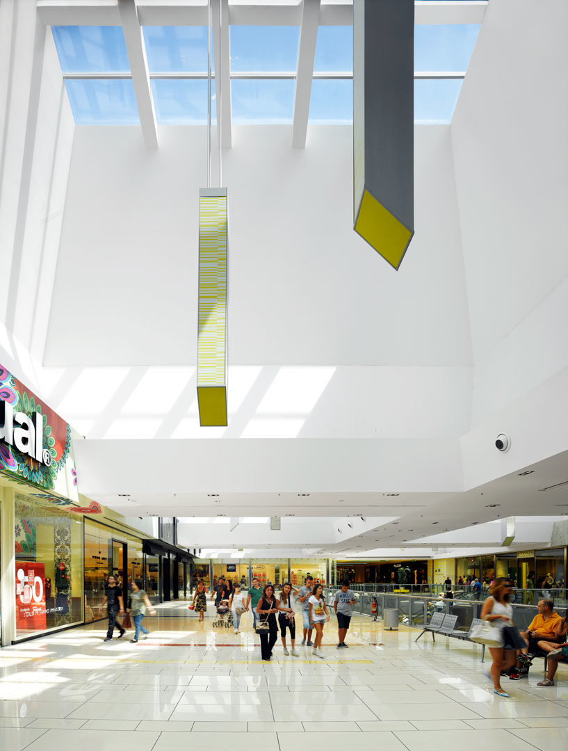
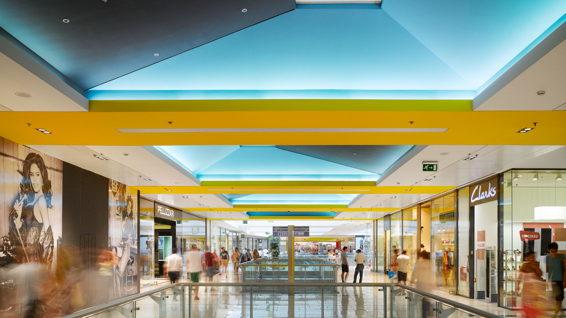
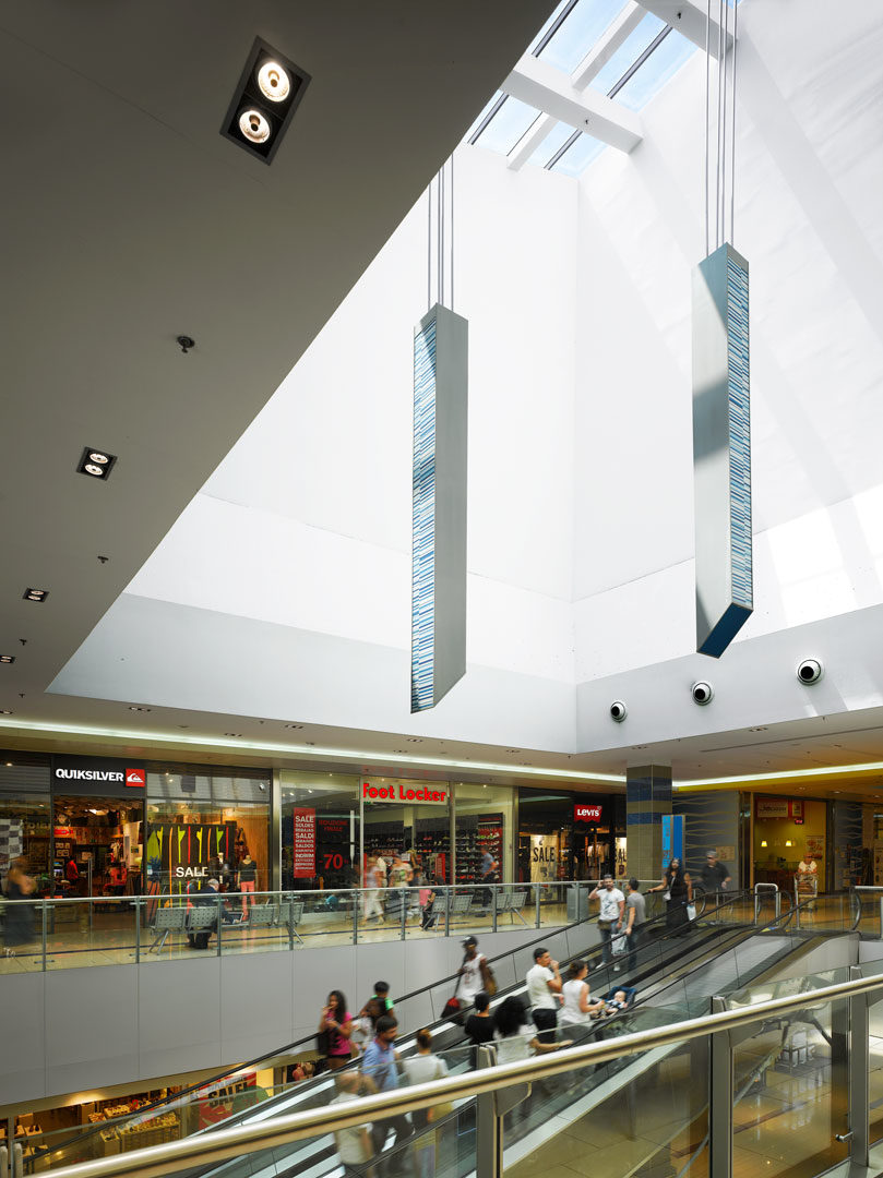
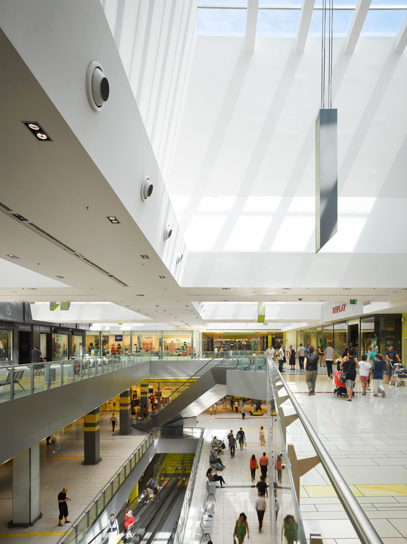
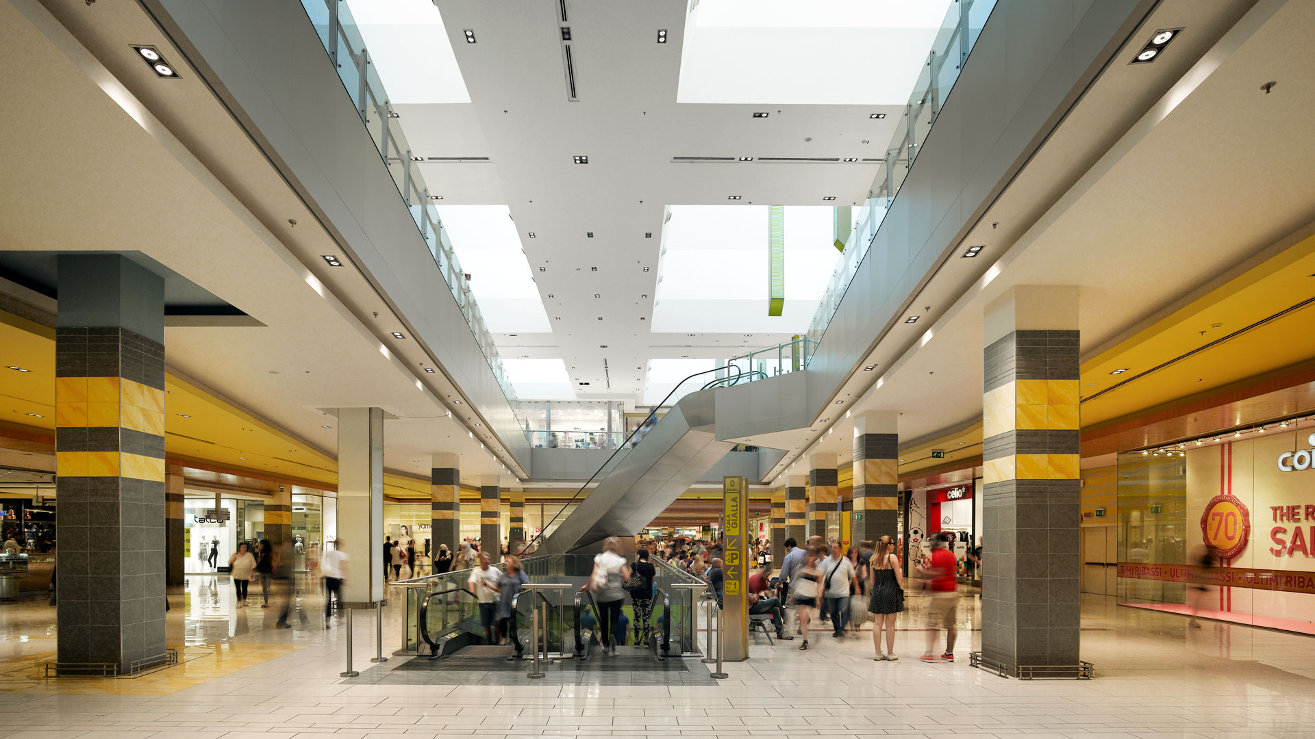
Porta di Roma’s interior layout was designed while the shell of the mixed-use project was under construction. Elevating the project without changing the structure involved four elements: A friendly landscape environment to replace the original uninviting plazas, a full graphics package to give the development personality, the invention of a false skylight with backlighting that appears to reveal natural light in order to mitigate an oppressively low ceiling, and a comprehensive redesign of the retail organization to fashion a more cohesive layout along with enhanced communication between floors and tenants. The project achieved a significant upgrade in quality without altering the building form, so that new permitting was never required. Furthermore, there was no delay in construction. The new shopping mall, complete with a newly conceived interior and exterior, opened on schedule.
